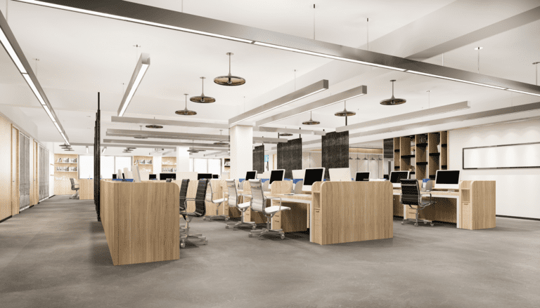
In office design, color has a strong psychological impact, affecting not only aesthetics but also the mood, productivity and well-being of the occupants. Each color evokes a different mindset and behavior that requires making the right choices to create an environment that supports creativity, focus, and collaboration. From soothing blues to energizing yellows, understanding the emotional impact of color is crucial to create a workspace that meets the needs and goals of the individuals within them.
Bringing Tranquility: Blue Hues in Office Fitout
Blue is often associated with feelings of calm, peace, and tranquillity, which is why it’s popular in workplaces where productivity and focus are crucial. Staying calm helps reduce employee stress and increases happiness, thereby making them more productive. Additionally, blue is known to enhance creativity and promote mental clarity, making it ideal for meetings and events that require creativity. However, it’s important to coordinate with other colors so that the space doesn’t feel too cold or dry. Representing warm tones or similar colors can create a pleasant, cheerful environment that enhances the benefits of a blue color scheme in the office.

Embracing Nature: Green Hues in Office Fitout
The psychology of green plays an important role in office fitout as it is believed to bring peace, calmness and happiness. Integrating green into the office environment can give employees peace of mind, reduce stress and promote happiness. In addition, green is often associated with nature, representing growth, renewal and life, and can promote creativity and productivity in the workplace. Additionally, research shows that exposure to green areas can improve performance and concentration, making it a good color choice for concentration and mental clarity.
Bringing Vibrancy: The Yellow Palette in Office Fitouts
Yellow is often associated with feelings of warmth, optimism and creativity. Its bright and cheerful nature can help stimulate mental activity, promote innovation, and foster a positive work environment. However, too much yellow can be overwhelming and lead to feelings of restlessness or loss of concentration. Therefore, when incorporating yellow into office design, it is important to strike a balance and consider the specific needs and preferences of employees. Incorporating yellow accents or using it in moderation as part of the overall color palette can help harness its psychological benefits while maintaining a harmonious workspace that is beneficial for productivity and health.
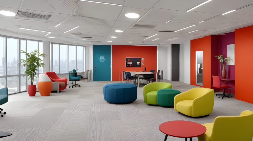
Bold Accents: Red in Office Fitout Design
Red is known to evoke strong emotions, such as passion, energy, and intensity. Incorporating red into an office environment can stimulate creativity, encourage action and promote a sense of urgency, making it suitable for environments where high energy and dynamic production are desired, such as in marketing or sales departments. However, too much use of red can also lead to feelings of aggression or tension, making it important to balance its presence with calming or neutral elements. When used strategically in office design, red can effectively improve employee motivation, dynamism and engagement, contributing to a vibrant and energetic work atmosphere. quantity.
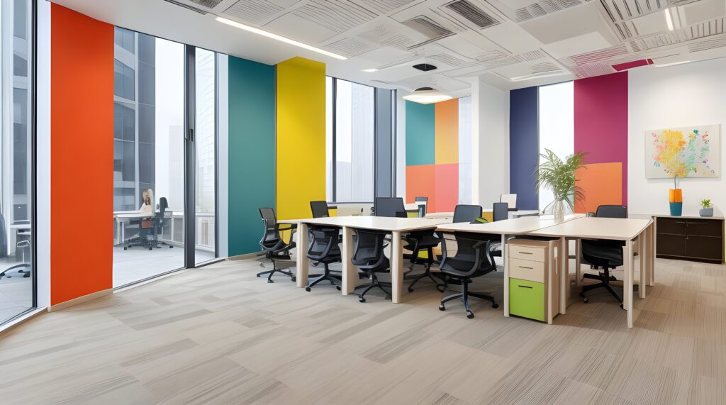
Vibrant Citrus: Embracing Orange in Office Fitouts
Orange is often associated with energy, enthusiasm and creativity, making it an inspiring choice for work environments that encourage innovation and brainstorming. Its warm and inviting nature can promote a feeling of warmth and sociability among colleagues, thereby promoting communication and collaboration. However, too much orange can be overwhelming and lead to feelings of restlessness or distraction, so it’s essential to balance its use with neutral tones or complementary colors. Additionally, the shade of orange chosen can evoke different emotions; Brighter oranges tend to bring more energy, while softer shades can create a calming effect.
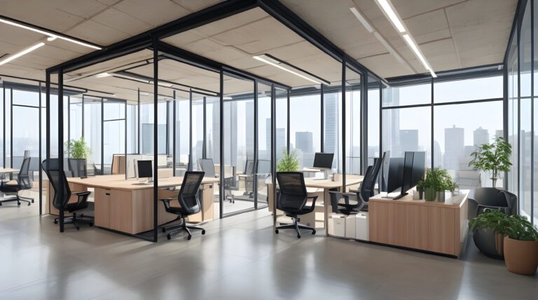
Subtle Sophistication: Neutral Color Palette for Office Fitouts
Neutral colors such as white, beige, and gray are known for their calming and soothing effect on individuals, making them an ideal choice for creating a productive work environment. In the office, where concentration is required, neutral colors can help reduce distractions and bring a sense of calm. Additionally, neutral colors provide a versatile backdrop that complements various design elements and furnishings, promoting a cohesive and professional atmosphere. Their understated elegance can also evoke a sense of sophistication and modernity, enhancing the overall aesthetic appeal of the workspace.
Conclusion
In conclusion, when designing an office fitout, it’s essential to consider the specific needs and preferences of employees, as well as the nature of the work being done in each space. Experimenting with different color schemes and incorporating elements of biophilic design, which seeks to connect occupants with nature, can help create a harmonious and productive work environment. Additionally, lighting, furniture, and other design elements should be carefully chosen to complement the chosen color palette and enhance overall comfort and functionality. Talk to QTC Build about how we can help you with your office fitout.